TIMELINE
2 weeks
ROLE
Lead Product Designer
COLLABORATION
Product, engineering, growth
CONTRIBUTIONS
UX strategy, interaction design, visual design, experimentation, mobile interface redesign
FOCUS
Mobile upgrade experience, conversion optimization, premium value communication
OUTCOME
+133% weekly mobile subscriptions and improved conversion confidence
Overview
AllTheRooms.Analytics is an analytics platform for vacation rental hosts to make data-driven decisions about their properties and improve earnings based on market performance.
The platform uses a freemium model where hosts can access basic market data for free, but need to subscribe to unlock advanced features.
Business problem
95% of subscriptions were happening on desktop, while only 5% came from mobile users. At the same time, 44% of our weekly signed-in users were using mobile devices.
This gap suggested that the mobile upgrade experience was not effectively helping users discover, evaluate, and act on premium features.
Observations
- Mobile users were rarely entering the subscription flow through primary CTAs.
- It was difficult to understand whether users were intentionally exploring premium features or opening upgrade flows by accident.
- We regularly received support questions asking what users would actually get by subscribing.
The core issue was not only conversion. We also lacked clear signals around user intent.
Designing for clarity
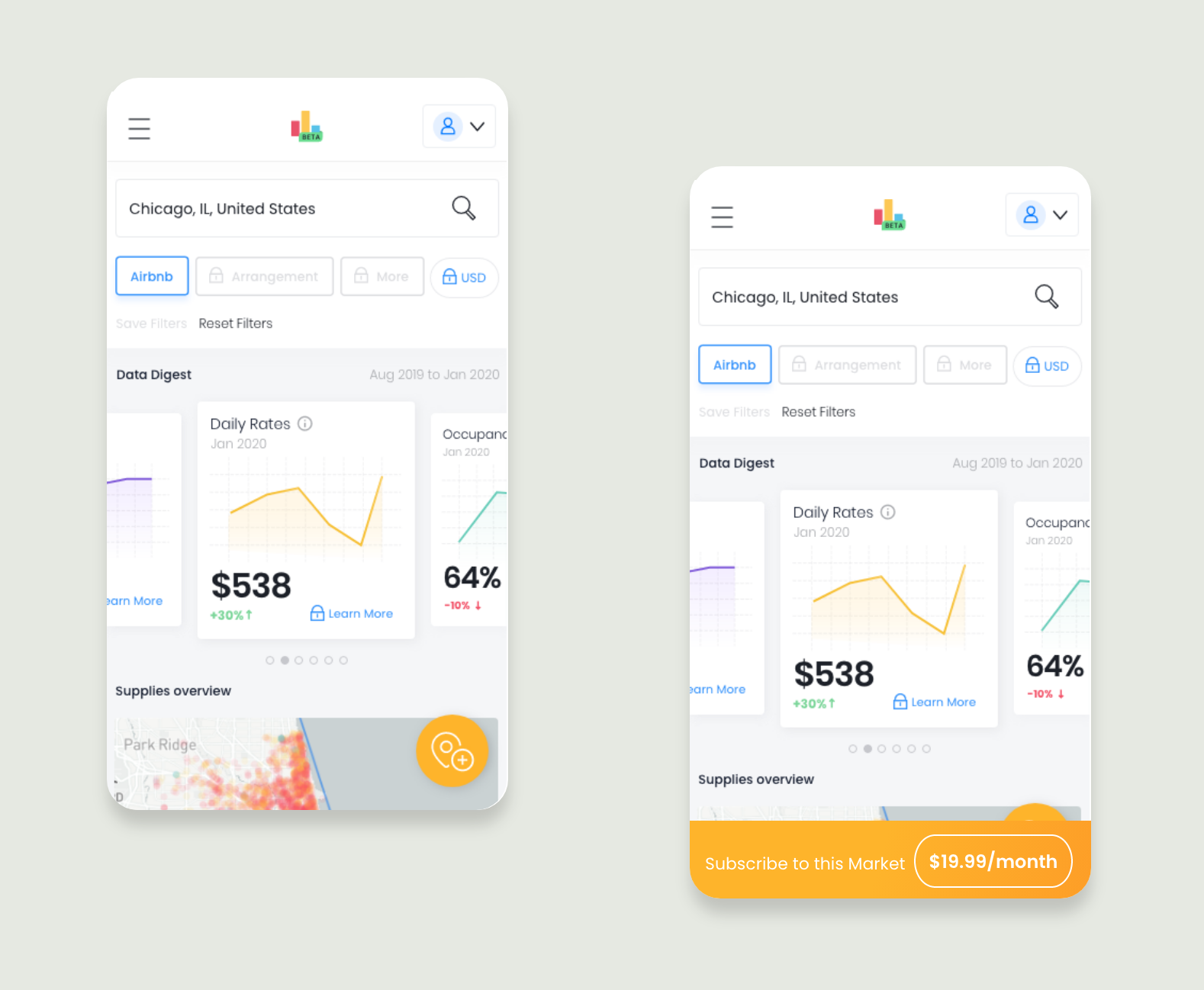
Upgrade actions lacked clarity
The primary upgrade action gave users very little information about what would happen next or what value they would receive by subscribing.
We replaced the ambiguous floating action with a persistent subscription CTA that clearly communicated the action, scope, and price of the subscription.
Data cards communicated information, but not value
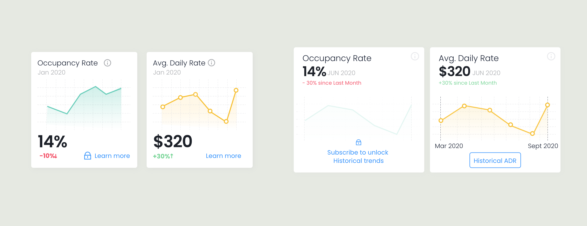
While users could access metrics throughout the product, the cards provided little context about the value of premium features. Many interactions appeared available until users clicked them and encountered an upgrade prompt.
The redesign improved information hierarchy, surfaced key contextual information, and replaced generic CTAs with feature-specific actions to make premium functionality easier to understand.
Premium filters interrupted exploration too early
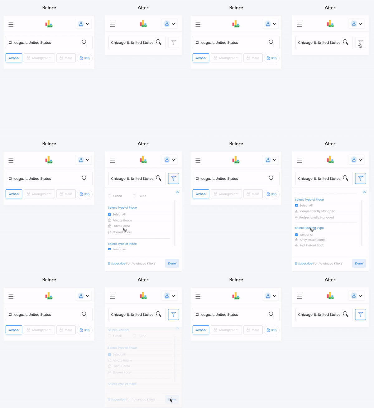
Users encountered upgrade prompts before they had enough context to understand which filters were available or why they might want access to them.
We redesigned the interaction to first expose available filter options and then guide users toward upgrading for premium access. This reduced friction, improved feature discoverability, and saved valuable vertical space on smaller screens.
Business outcome
Weekly mobile subscriptions increased from 3 users to 7 users (+133%).
As similar improvements were applied across the experience, conversion rates increased from 2.5% to between 3.92% and 5.77%.
Product outcome
Clearer upgrade patterns gave us better visibility into user intent and helped us identify which premium features users found most valuable.
Project notes
This project focused heavily on reducing usability friction so we could better understand whether users were intentionally choosing not to subscribe or simply struggling to understand the product’s premium value.
Looking back, I would have pushed harder to prioritize UX debt more broadly across both mobile and desktop experiences, instead of treating the mobile flow as a more isolated conversion problem.